Ronico
Brand Identity
Ronico is a tulip company in the north of the Netherlands. It is a family company, founded in 1939. Over 75 years later, Ronico is now one of the leading tulip producers in the world.
Why did they approach us?
At Ronico it’s all about growing. The only thing that had continued to grow over the years was the identity they communicated or a business-like image. After all those years, it was clearly time for a thorough rebranding. A new, professional image that will help this superb tulip company on the international market for years to come.
How did we approach this?
To get a good feeling for the task from a design perspective, we visited Ronico in Noord Holland to capture some of the company’s unique atmosphere. The wonderful colours, the people and the enormous tulip fields. Next came a workshop to determine the company’s core values. What makes Ronico unique, and which values does it want to radiate? Using this input we elaborated and delivered several creative concepts for the new look.
What was the result?
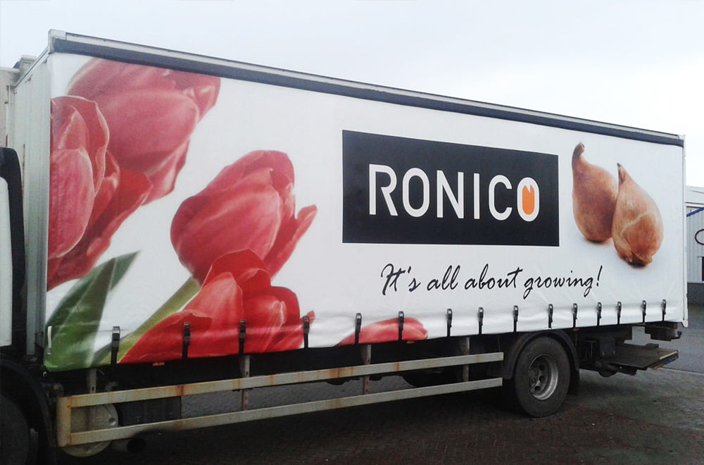
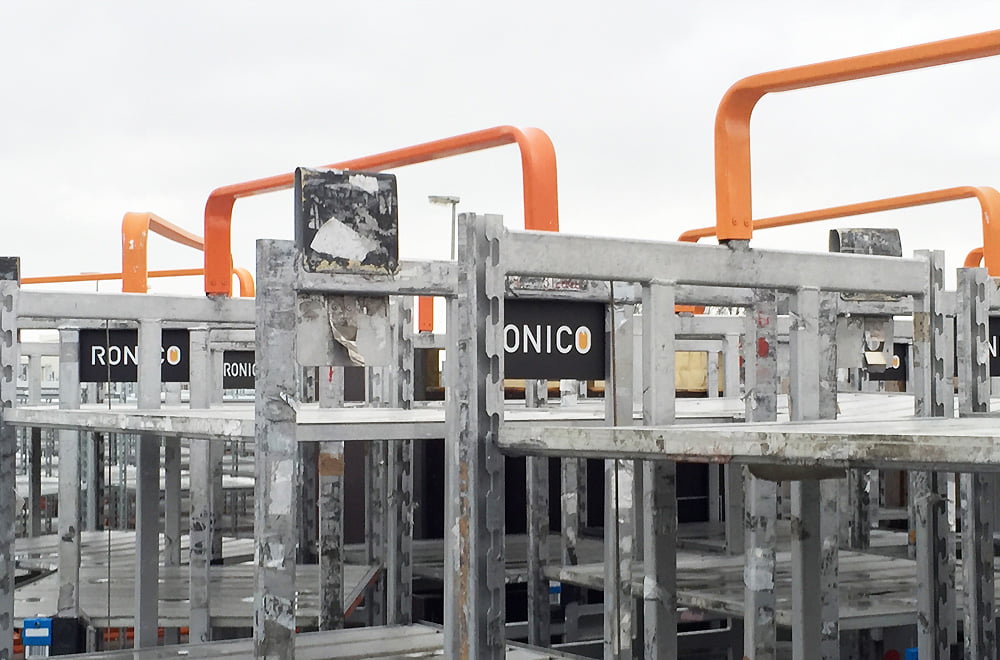
Companies that are all about flowers need a fresh, colourful brand identity. A made-to-measure corporate design identity that highlights Ronico’s core business in one go. The orange tulip in the word symbol matches the typography perfectly while at the same time creating a window in which to illustrate all the company’s processes and methods. The orange colour was chosen very carefully. There are so many shades of orange that each tell their own story. The orange we selected for Ronico perfectly fits their tulips and at the same time is the Netherlands’ national colour. Down-to-earth and simply right – they can look forward to a rosy future.


